Talk to any ultramarathon runner who has been in the sport for a while, and they are bound to have an opinion on its growth and evolution. It’s a fun topic of conversation. And don’t numbers make things even more fun?
If we had data on ultramarathon races and finishers across a country or continent, we could dig into where the ultra scene is already well-developed and where the untapped markets exist. Or conversely, we could consider the hidden gems that maintain the intimate, grassroots atmosphere of the sport’s origins.
That’s what we’re doing in this article, sharing a statistical analysis of the geographical distribution of ultramarathon races and runners in the United States and Canada.
The fine folks at “UltraRunning Magazine” generously shared 10 years’ worth of data on ultramarathon races in North America. We are looking forward to doing a similar analysis later that’s global in scope, but we’ll need more time to wrangle a dataset. “UltraRunning Magazine” is incomparable for its diligent collection of race results, so we were spoiled by getting the North American numbers served up on a silver platter. That being said, we cannot assume that every race is captured in this dataset.
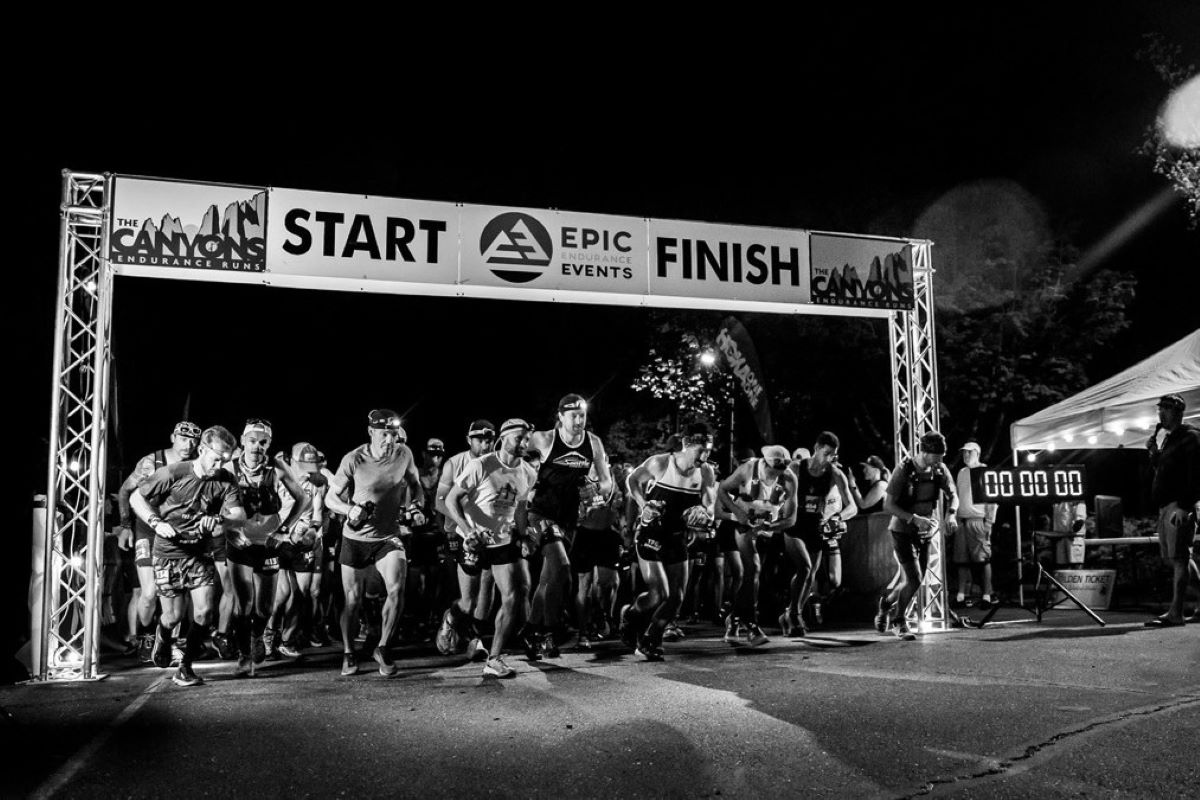
The start of the 2019 Canyons 100k in California. Unsurprisingly, California came out on top as the U.S. state with the most ultramarathon races. Photo: Canyons 100k/Scott Rokis
Which Areas Have the Most Ultramarathon Races?
“UltraRunning Magazine” counts each race distance at a given event as a separate race. I love that approach because it allows us to capture the magnitude of an event that has three or more race distance options with hundreds of runners in each. When we count the total number of races per U.S. state and Canadian province/territory, we discover which places are racing hotbeds. The lists below have the top results per country, and the heat maps below show how the states and provinces compare to one another.
Most Ultramarathon Races, by U.S. State
- California
- Texas
- Florida
- Washington
- Georgia
- South Carolina
- North Carolina
- Virginia
- Arizona
- Colorado
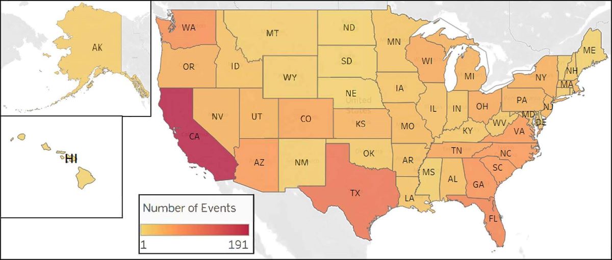
The heat map above shows the continental United States, Alaska (insert, top left), and Hawai’i (insert, bottom left.) States with more ultramarathons are darker in color. One event with multiple race distance options is counted multiple times, with each ultramarathon race distance considered a separate race. All images, unless otherwise noted: Mallory Richard
Most Ultramarathon Races, by Canadian Province/Territory
- Ontario
- Alberta
- British Columbia
- Québec
- Manitoba
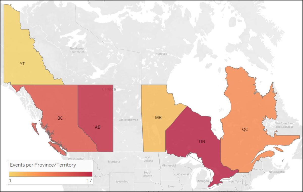
The map above shows the distribution of ultramarathons in Canadian provinces and territories. As the note on methodology at the bottom of this article explains, the dataset on which this article is based has some gaps. This is most evident with the Canadian maps, as some provinces, like Saskatchewan, look like a blank void when, in fact, some ultrarunners do live and race there.
Interestingly, these maps all represent a one-year period from November 1, 2021, to October 31, 2022. As you can imagine, social gathering restrictions related to the COVID-19 pandemic may have still been a factor during that timeframe. We hope to dig into this further in a future article.
Which Areas Have the Most Ultra Finishers?
California wins this title handily, boasting 11,145 finishers. The heat maps below show how the other states and provinces compare. These heat maps raise some fun questions well-suited for discussion on a long run. Namely, if your province or state has a large number of finishers, is it because:
- There are a lot of ultrarunners in your area?
- Your area is home to some destination races that attract participants from other regions?
- The ultrarunners in your area are a particularly well-trained, competent bunch who execute their races well, so finisher rates are high?
Most Ultra Finishers, by U.S. State
- California
- Arizona
- Texas
- Utah
- Virginia
- Oregon
- Colorado
- Maryland
- Washington
- Pennsylvania
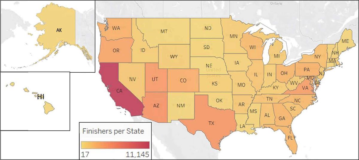
The heat map above shows the continental United States, Alaska (insert, top left), and Hawai’i (insert, bottom left.) States with more ultra finishers per state are darker in color.
Most Ultra Finishers, by Canadian Province/Territory
- British Columbia
- Alberta
- Québec
- Ontario
- Manitoba
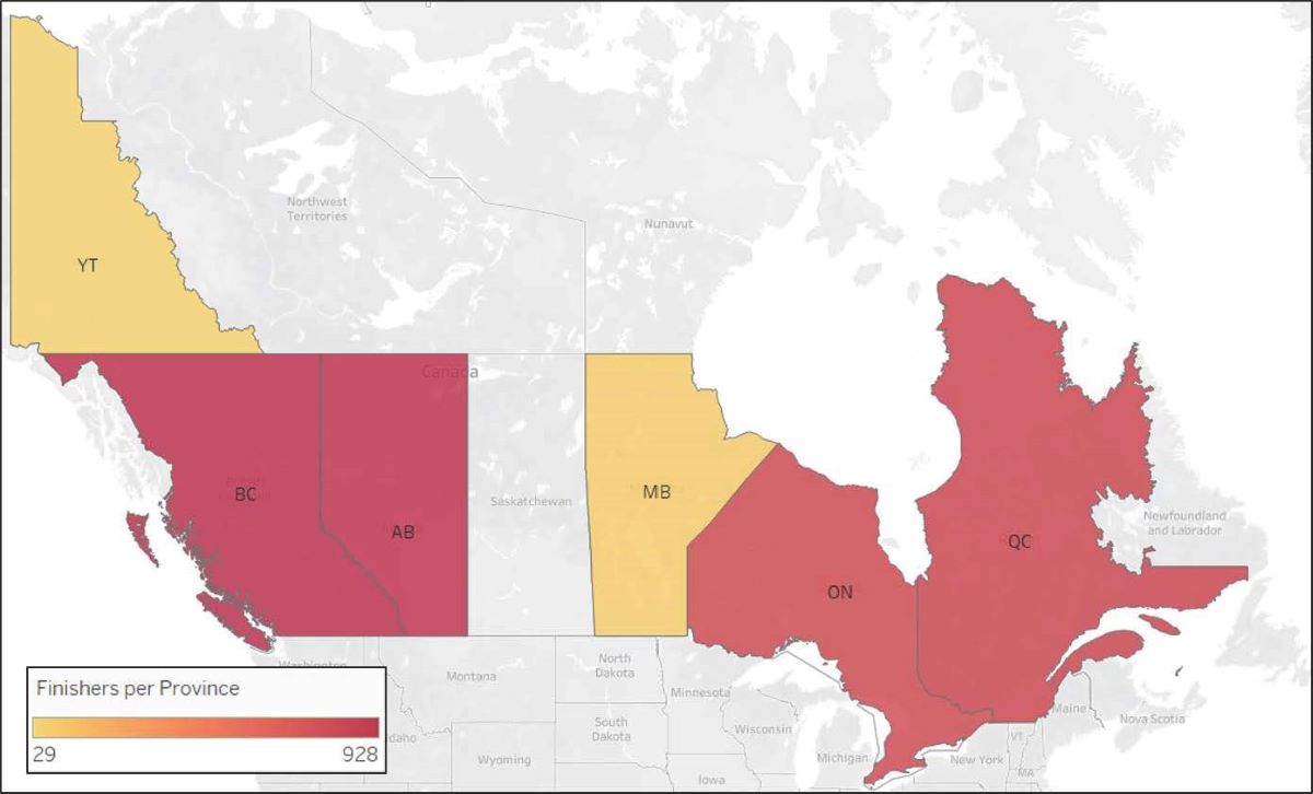
The heat map above shows Canada. Provinces/territories with more ultra finishers per province are darker in color.
Which Areas Punch Above Their Weight Class?
Sure, California boasted 11,145 ultra finishers in 2021 to 2022. But the state boasts a current population of 39,029,342, which is approximately 50 times more people than North Dakota, which some great runners I know call home. To make an apples-to-apples comparison, the tables and maps below show the number of ultra finishers per 100,000 residents. Looking good, Yukon!
Top U.S. States for Ultramarathon Finishers per 100,000 Population
- Utah
- Wyoming
- Oregon
- Arizona
- Vermont
- West Virginia
- Colorado
- Virginia
- Idaho
- Maryland
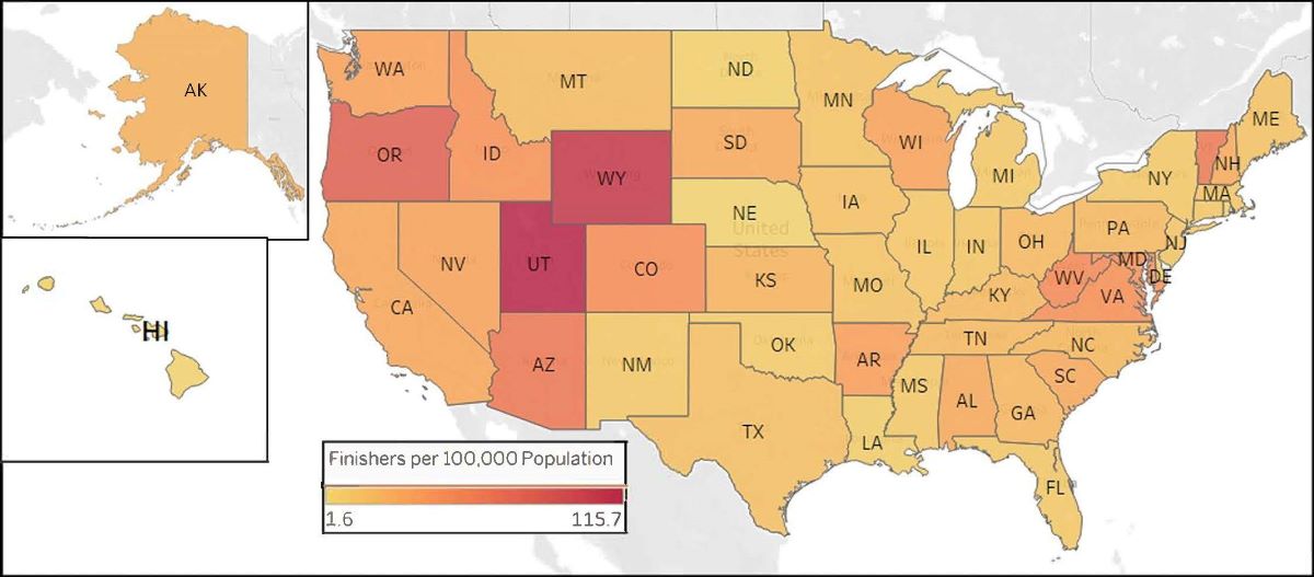
The heat map above shows the continental United States, Alaska (insert, top left), and Hawai’i (insert, bottom left.) States with more finishers per 100,000 population are darker in color.
Top Canadian Provinces/Territories for Ultramarathon Finishers per 100,000 Population
- Yukon
- Alberta
- Québec
- British Columbia
- Ontario
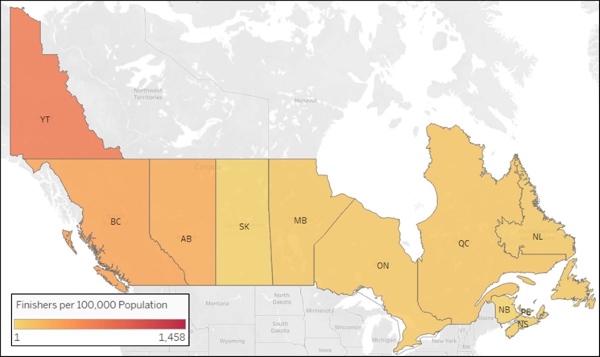
The heat map above shows Canada. Provinces/territories with more finishers per 100,000 population are darker in color.
Which Areas Have the Most Attended Races? Which Have the Most Intimate Races?
Finally, we can divide the number of finishers by the number of races. That gives a ratio of the number of runners per race. This isn’t perfect, of course. For example, Arizona had 399 runners finish the 100-mile race at the Javelina 100 Mile event, but the nearby Desert Solstice Track Invitational race had a much lower cap and only 18 finishers.
This time, the province of Québec stands out for attracting the largest fields per race: according to “UltraRunning Magazine,” races in the Belle Province attract 117 runners per race. Rather, I should say 117 finishers per race — I can say from personal experience it has its share of challenging and DNF-worthy courses. Conversely, Hawai’i leads the pack for hosting small and challenging races that result in the fewest finishers per race.
U.S. States with the Most Average Finishers per Race
- Utah
- Maryland
- Oregon
- South Dakota
- Wyoming
U.S. States with the Fewest Average Finishers per Race
- Hawai’i
- North Dakota
- Nebraska
- Louisiana
- Rhode Island
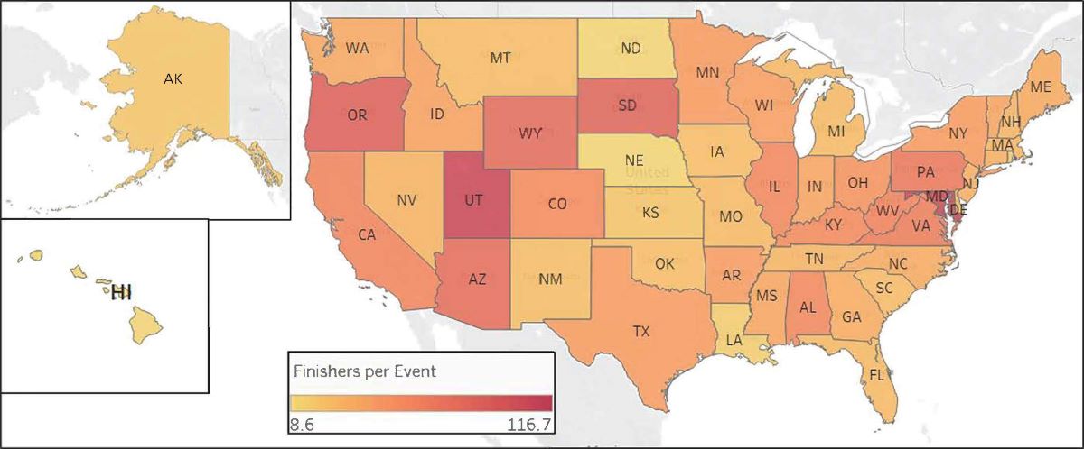
The heat map above shows the continental United States, Alaska (insert, top left), and Hawai’i (insert, bottom left.) States with more finishers per race are darker in color.
Canadian Provinces with the Most Average Finishers per Race
- Québec
- British Columbia
- Alberta
Canadian Provinces with the Fewest Average Finishers per Race
- Manitoba
- Yukon
- Ontario
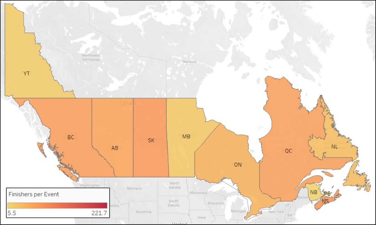
The heat map above shows Canada. Provinces/territories with more finishers per race are darker in color.
Conclusion
As I created these heat maps, I gained a deeper appreciation for some states where I’ve raced, like Wyoming, that boast disproportionately powerful races and running communities relative to their population. Just as much, it reminded me how wonderful it feels to be part of a fairly tight-knit community with a lot of familiar faces at every local race. There’s nothing like a heat map to make me feel all warm and fuzzy inside. I hope you enjoy them, too.
A Note on Methodology
“UltraRunning Magazine” graciously provided the dataset (on which this article is based) in November 2022. It is a remarkably thorough historical dataset that includes over 18,000 records. That being said, “UltraRunning Magazine” would still have been receiving and compiling race results from late summer and early fall of 2022 when we received this data. Therefore, some races will be missing, and some ultramarathon finishers will not be included in these tallies. Since the objective of this column is to use running data as a starting point for fun discussion and contemplation, we decided it was acceptable to run the analysis knowing there would be some gaps.
Call for Comments
- Any fun discoveries as you looked at these heat maps?
- International readers, do the most popular states and provinces to race in align with where you race (or dream of racing) when you come to North America?
- The data we received only reported the number of finishers. Do you think any states or provinces were underrepresented for participants because their races have lower finishing rates?
- Do you have a comprehensive dataset, or a good sample set, for global ultra participation you would be willing to share? “Asking for a friend.”

Ellie Greenwood on her way to winning the 2014 Squamish 50k in British Columbia, Canada. Photo: iRunFar/Meghan Hicks
